My work as a UX writer at Vanguard has often laddered up to larger business initiatives, and no project has exemplified this quite like Browse: a new, mobile-only experience that guides users through the basics of our investment offerings and making their first prudent investment.
Challenge:
For a while, user research and client interviews had been identifying a crucial weak point in our onboarding process on both the Vanguard website and app: namely, our lack of a coherent, guided introduction to investing.
The process to open a new investment account with Vanguard is fairly straightforward, but we heard time and time again that new investors felt thrown into the deep end once their accounts were set up. It’s one thing to understand basic investing principles like the importance of diversification and investing early, but practical questions like what specific funds or stocks should I invest in and how do I find them? and how do I adjust what I invest in based on my goals? still remained for many of our clients.
Process:
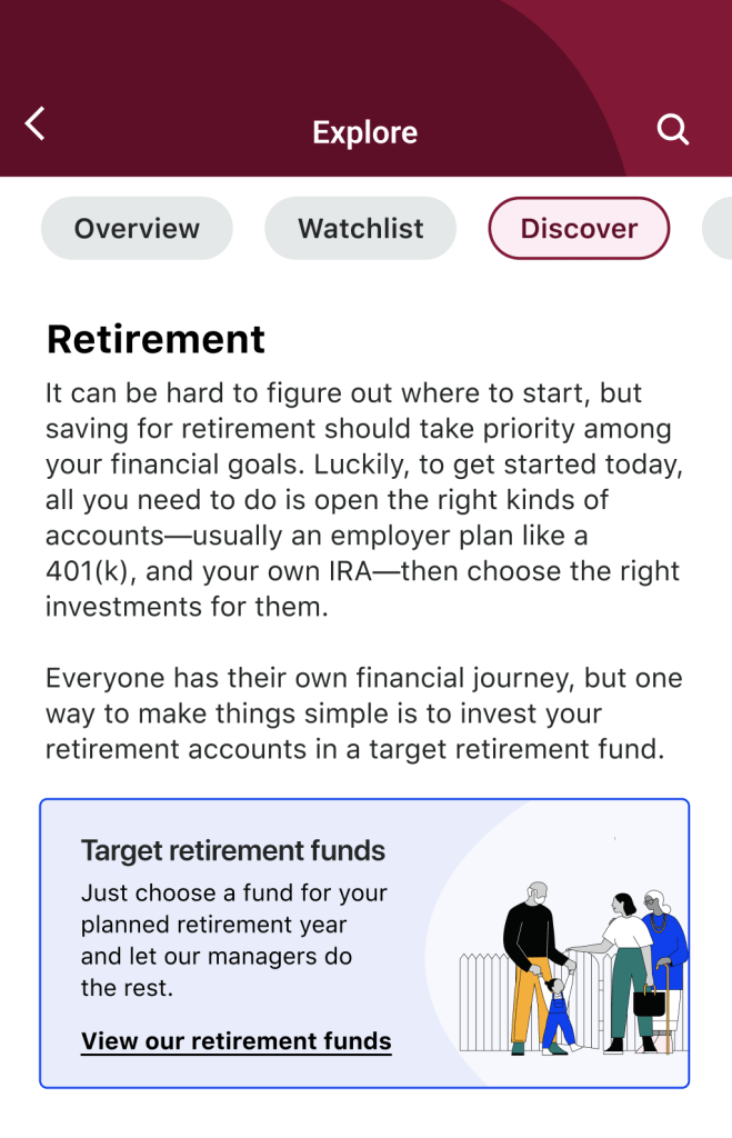
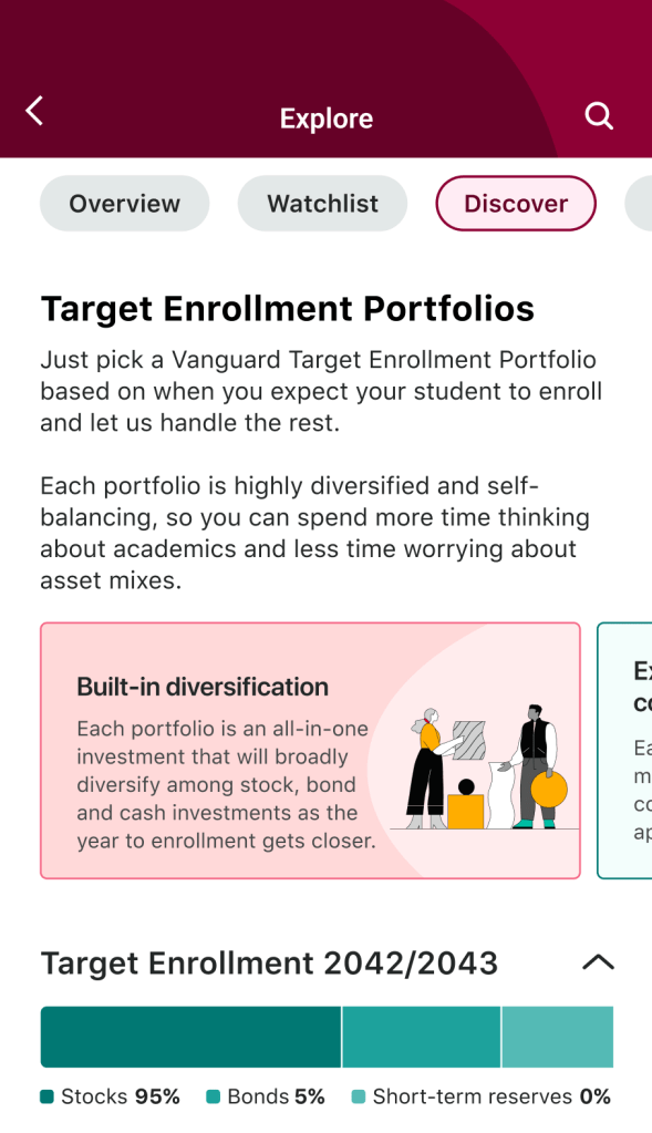
After significant user testing and exploration of the resources available for beginner investors on the Vanguard website, our team landed on two main paths for our Browse experience: Browse by product type (mutual funds, ETFs, etc. – not pictured) and Browse by goal (retirement, education, emergency fund, and short-term goals).
We had a good amount of content to work with from the website, but the experience was marked by webpages that only served as landing pages for other webpages, webpages that contained important information but were nestled deep in a path of links from other webpages, webpages that linked to new webpages that just linked back to the original webpages…

All in all, a jungle of resources that’s already hard to navigate on web, but simply can’t be translated to mobile.
I worked closely with our designers and UX strategists to construct an IA that worked for a mobile context, distilling our web resources into a coherent, more navigable experience for new investors.

Then, of course, came the writing, which was based heavily on the content from our web experience but condensed for a mobile setting and organized according to our new IA. Following web’s lead on investment recommendations was especially important because our little corner of the mobile app only has so much insight into personal finance best practices, market performance, and what investing behaviors Vanguard can legally, and more importantly, responsibly, promote.


Outcomes:
In the end, we created a research-backed, legal-compliance-approved, empathetic experience for new investors that guides them through a number of concepts so they can get started: where and how to invest, the importance of diversification, and the distinction and connection between investment account types and investment products. Everything they need to get started (even the best of user experiences can only do so much with the complexity of finance).
