While I often find myself translating complex financial topics or user experiences to digestible content, sometimes I’m faced with explaining a feature that isn’t quite either: this was the case with the spending fund, a feature available to Vanguard Personal Advisor clients that allows them to withdraw from or contribute to investment accounts that usually only their advisors can trade with.
Challenge:
Spending funds have already been available for Personal Advisor clients on the Vanguard website, but user interviews and research done on both web and mobile have found that it’s a point of confusion for clients, who don’t understand how it functions, or why it even exists in the first place. Even our own team needed a few meetings to wrap our heads around it at first.
Process:
Previous user research done on the web side and new research done for mobile found that many clients didn’t understand why they needed a spending fund to begin with. Why interact with accounts that you’re paying an advisor to oversee? And once you do have one, what exactly do you do with it? How do you make sure you’re using it right? When translating the web experience to mobile, we found a number of places to improve upon the content for clarity on the why and how of spending funds.

Web content for clients without a spending fund – but the explanation of why they might want to open one is vague.

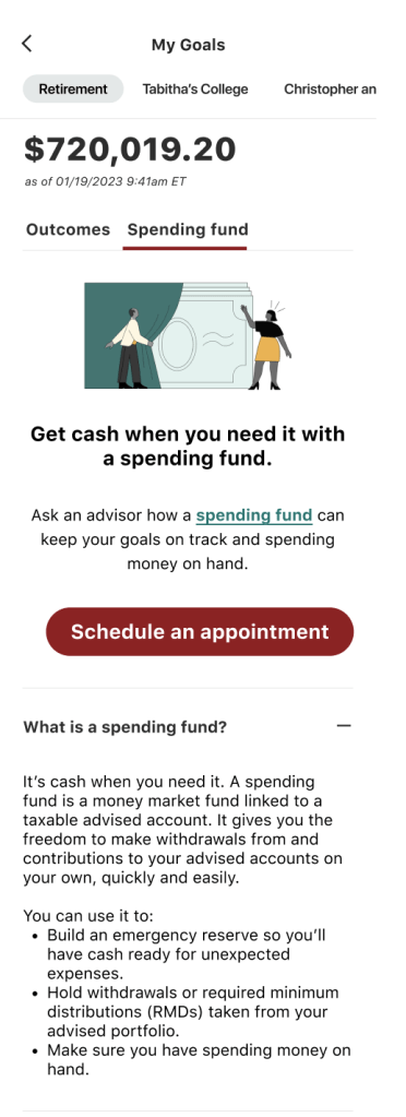
Working with designers, UX strategists, and previous research and marketing surrounding spending funds, we created a more inviting “intro” screen for clients without a spending fund to build a mental model of it as a liquid place to hold funds associated with your advisor-associated accounts. We also highlighted the benefits of keeping a spending fund to further reinforce its use. Still, we wanted to avoid overloading clients with information – someone paying for a financial advisor probably isn’t one to get in the weeds of their finances.

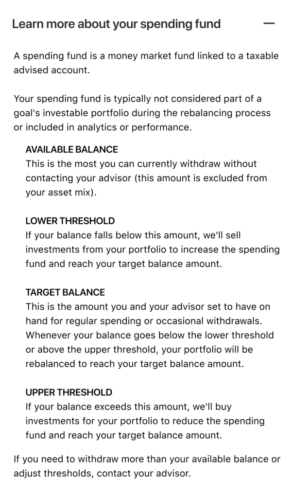
Clients with existing spending funds, on the other hand, got a new, dynamic visualization of their spending fund balance and features, along with definitions of each. Note the redundant information for “Target balance” – user testing found that the definitions for the lower and upper thresholds alone were sometimes not enough to reinforce the idea of a spending fund returning to a chosen equilibrium when its balance went too low or too high.
Outcomes:
The addition of the spending fund to the app was tabled due to technical constraints, but a presentation of the new content and visualization to key stakeholders found that the decisions our team made were the right choice – no more confusion around what spending funds do and how they do it.
